How to Add Error Bars in Microsoft Excel?
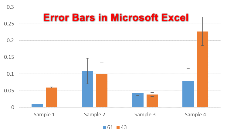
Error bars in Excel are simple visual tools that show how much your data might vary or how certain you can be about the results. You’ll often see them in scientific and statistical charts because they help explain things like confidence intervals or how spread out your numbers are.
When using custom error bars, remember that the numbers you enter should show how much your results can vary, not the actual data values themselves. For example, if you want to highlight the range from the average (mean) to the highest and lowest numbers in your data, calculate the difference between the average and these points. Then, use those differences for your error bars.
Adding Error Bars in Microsoft Excel
Error bars in Excel can be added to different types of charts, such as scatter plots, dot plots, bar charts, or line graphs. These error bars provide extra details about your data, helping you and your viewers understand how reliable your measurements are. By default, Excel uses standard error when you add error bars, but you can also set them to show a percentage, standard deviation, or a specific value you choose. You can further change the look and feel of your error bars—such as their color, direction, and more—using the Format Error Bars menu.
- Open the Microsoft Excel program and create a new blank workbook, or open an existing file from your computer.
- Enter the data into your sheet that you want to use for your chart. Highlight the data, then click the Insert tab at the top. Click the Insert Column or Bar Chart icon and select the chart type you want to use.
Note: Make sure your data is accurate. If your data isn’t correct, the error bars might not display properly.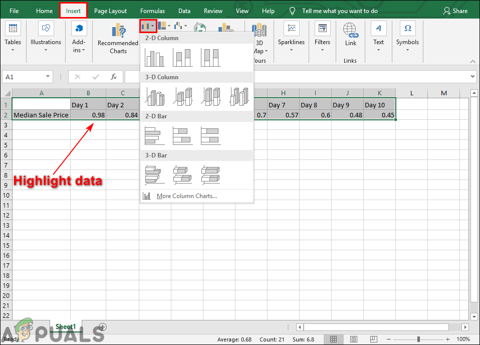
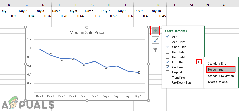
Highlight data and add a chart - Click the Chart Elements (plus sign) button next to your chart, then check the Error Bars option from the list. This will add error bars to your chart, showing the standard error for all the values in your data set.

Adding the error bars - You can also click the small arrow next to Error Bars and select the Percentage option. This will set the error amount as a percentage for each value.
Percentage option for error bars - There’s also a Standard Deviation option in the Error Bars list, which will show the standard deviation for all the values in your chart.

Standard deviation option for error bars - If you want to customize your error bars even further, click on More Options. This will open the Format Error Bars panel on the right side, where you can easily change the style, color, or set specific values for your error bars.
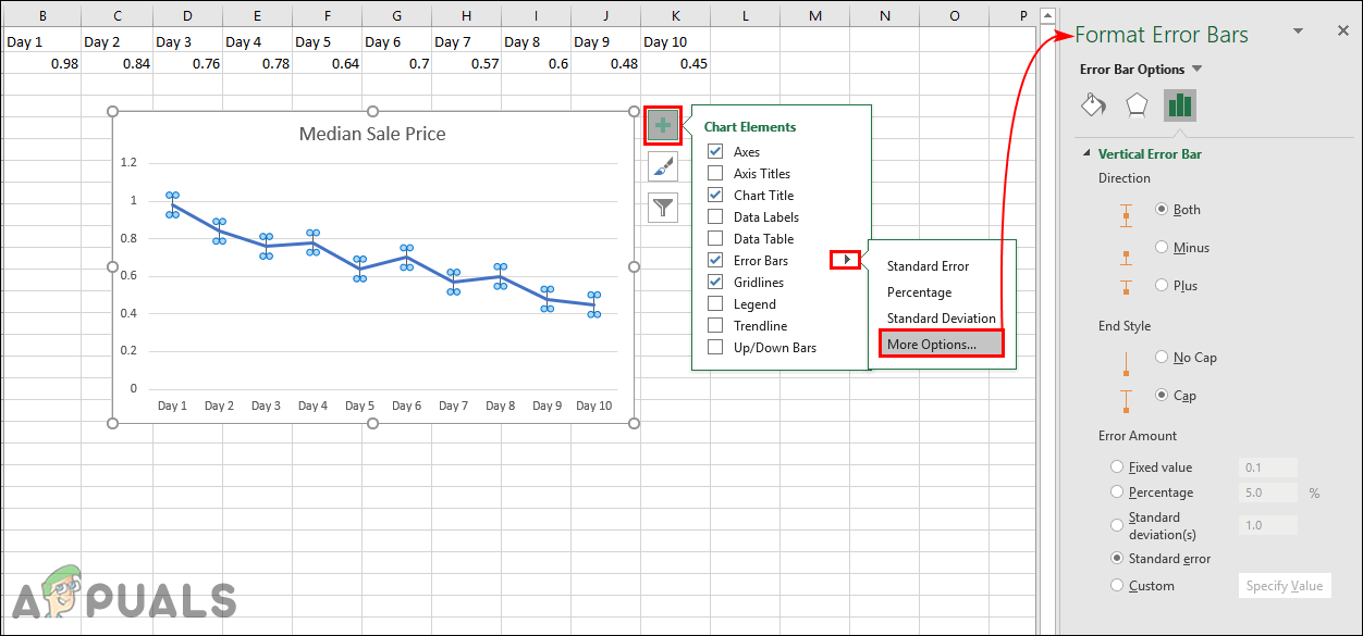
More options to format error bars