Apple finally tones down the ‘glassiness’ on the Liquid Glass Control Center

Apple has now fixed one of the major complaints with the new Liquid Glass in the first iOS developer beta. The Control Center now gets a new, less glassy look in the second beta update, making the text much more readable.
Not only did the background get a tinge of Gaussian blur, but the buttons are now slightly more opaque as well. In the first release, the interface’s ‘glassiness’ meant that you could fairly easily see what was under the Control Center. However, that design hurt readability.
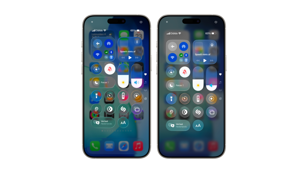
The new update doesn’t entirely stray away from the inherent design scheme; it keeps most of the optical qualities of glass in the way it ‘bends’ light. You can still see the colors from the underside bleeding into the Control Center itself.
It’s now a bit more translucent, and a lot more legible.
This is all we know for now, but rest assured that we will keep you updated as new information becomes available.