After Gmail, Calendar, Drive, & More, Google is Now Making the Play Store Logo Ugly Too
It's part of a larger problem.
What is up with Google’s fascination with ugly logos? Back in 2020, the company updated Google Workplace with modernized logos as part of its efforts to reimagine G Suite. It was unanimously agreed upon that the new logos were bad. Not just bad, but a shining example of the over-simplification trend we’ve been seeing plague corporate design for the past few years.
Ever seen a graphic with people depicted as big blobs with disproportionate anatomy and contrasty colors? That’s referred to as “Corporate Memphis” and represents what modern corporate art styles have become. In an effort to appeal to everyone, especially with an ever-changing society, all sense of boldness and risk-taking has been phased out in favor of half-assed ambiguity.
If you want to learn more about the growing prevalence of Corporate Memphis, Solar Sands made a fantastic video diving deep into the ethos of design; why today’s Big Tech art style feels so uninspired and ‘fake’. Going Under, a roguelike game satirizing utopian optimism (basically dystopia), is another fascinating take on this. It features an art style that makes everything look like its part of one of these corporate illustrations.
Making the Play Store ugly
Google followed suite (no pun intended) in this trend when it rebranded G Suite as Google Workplace and replaced the highly-identifiable logos of some of its most popular services with blobs of red; green, yellow, and blue. Still, there were a couple of products that the company left untouched, namely Android.
We saw a big design overhaul come to non-Apple smartphones with Android 12, but it was mostly tasteful and ultimately allowed for more customization, which is good for the end-user. Google didn’t actually changed the logos for most of its well-known apps inside Android, which brings us to today’s heartbreaking news.
One of the most iconic logos under Google’s belt is the Play Store. It was last updated in 2017 when Google separated the multi-color triangle from the bag icon. In its current state, it’s perfect. Anyone with even a moderate knowledge of smartphones can see the logo and immediately recognize it as Google Play Store or at least associate it with the Android platform.
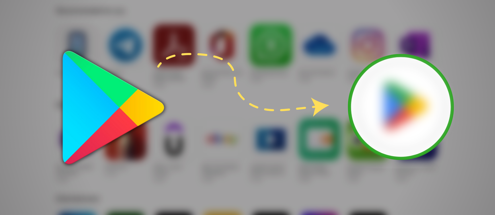
Unfortunately, news broke out a few hours ago about a possible design revamp coming to the Play Store logo. And guess what, Google has changed it to be more in-line with its Workplace logos. Or in other words, the company has successfully ruined yet another beloved icon.
9To5Google got the scoop on this as they report of a new Google Play logo being spotted in some parts of Android. The design cannot be seen on Play Store’s website or any of Google’s other marketing material as of yet, which means the company is likely testing it out with a gradual rollout. The logo’s kinda blurry since it’s situated inside cropped screenshots, but I digress.
Looking at the logo itself, it still looks familiar. We have the same rounded-triangle with the four punchy colors. However, it seems like the shades of these colors have been darkened across the board. The logo, therefore, looks less vibrant, more dull, and fits better with the rest of the company’s muted corporate identity.
Not only that, but the internal partitions between the four colors have also been resized. They now look to be more even, with the same amount of space being dedicated to each color, more or less. Previously, blue was the dominant color, with the other three providing a vivid assist. Simple, yet elegant.
According to 9To5Google, this logo can only be seen inside the Google Pay (or GPay) app. When you go to make a transaction pertaining to Google Play, for instance buying an app, it shows the updated Google Play logo as the merchant icon in the app. We don’t know when this was updated to be the case.
In fact, there is no word on when Google will announce this change, or if they even will make an announcement to inform the public. About a month ago, play.google.com was redesigned from the ground up to be more suited for today, that would seem like the right time to introduce a new logo, but alas.
Even more recently, Google removed the “Movies & TV” section from the Play Store in all regions around the world. The imminent retirement of Play Books is also looming every day. We can’t say for sure if Google would give a proper spotlight to this new logo in the coming weeks, or whether it’s just part of the many silent changes the company’s doing behind the scenes.
One thing is certain, however, change will always be unpleasant.