How to Make a Line Graph in Google Sheets
Understanding statistics and data sets can sometimes be challenging, especially because it’s hard to visualize data changes in your head and analyze them effectively. That’s where Line Graphs become extremely helpful. You can easily insert them in Google Sheets right alongside your data.

In this article, we’ll not only explain what a line graph is, but also guide you on how to create one in Google Sheets using both single and multiple data sets.
What is a Line Graph in Google Sheets?
A line graph, sometimes called a line chart, is a visual tool for showing data as a series of points connected by straight lines. Line graphs are easy to read and can be customized to match your preferences. They are perfect for highlighting patterns, relationships, and changes over time. By using line graphs in Google Sheets, you can quickly spot trends and make better decisions based on your data.
You can use these kinds of charts in many situations. Whether it’s a PowerPoint presentation showing company growth or a weather report illustrating daily temperature changes, their uses are practically endless.
How do I Create a Line Graph With a Single Data Set?
Let’s walk through an example using a sample data set. You can use these same steps with your own data in Google Sheets:
- Suppose we have the daily average temperatures in a city for the month of May 2023.
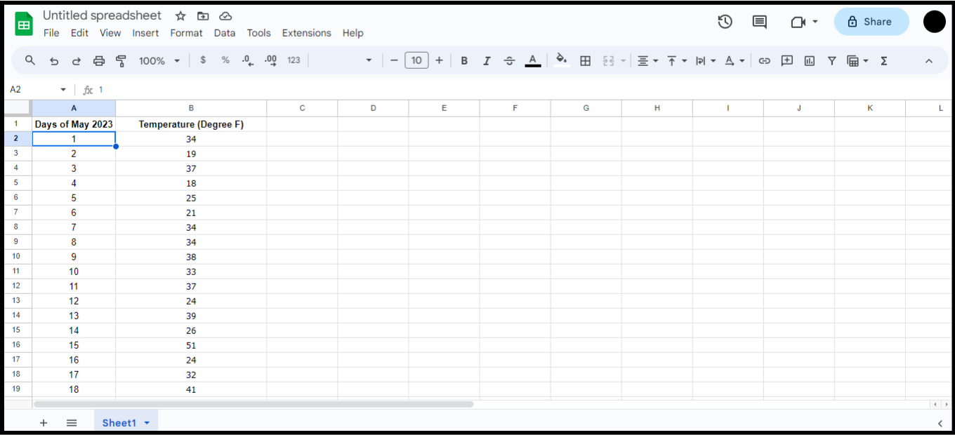
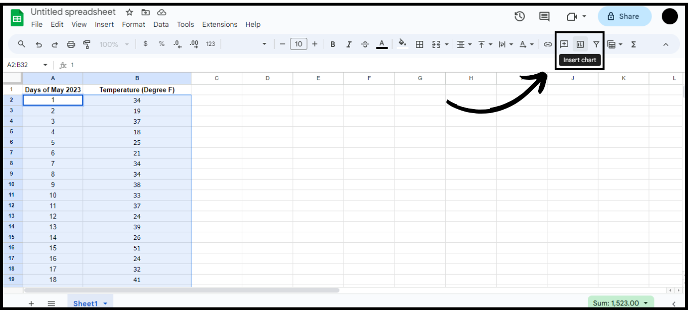
Sample Data Set for a Line Graph - Highlight the data cells you want to use for your Line Graph.
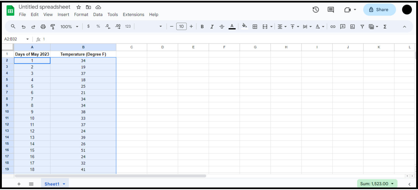
Select all the data by highlighting it - On the top toolbar in Google Sheets, click the Insert Chart icon.
Click on Insert Chart - A Line Graph will be automatically created for your data.
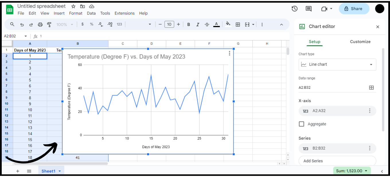
A Line Chart is plotted - You can customize your graph further using the Setup and Customize tabs in the Chart Editor.
How to Create a Line Graph with Multiple Data Sets?
Line graphs with multiple data sets allow you to easily compare or analyze different sets of information side by side.
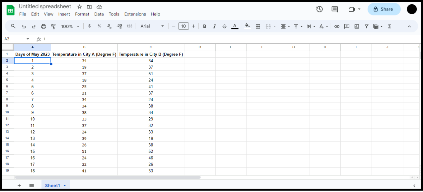
- For example, let’s say we have temperature data for two different states in the US for the month of May.
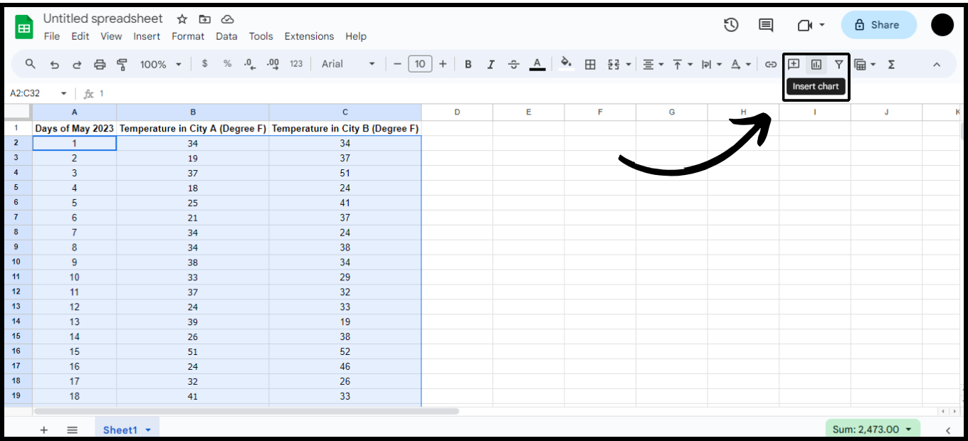
Multiple Data Set Sample - Select all the data rows and click the Insert Chart button in the toolbar.
Click on the Insert Chart Button - Google Sheets will generate a Line Graph showing your two data sets.
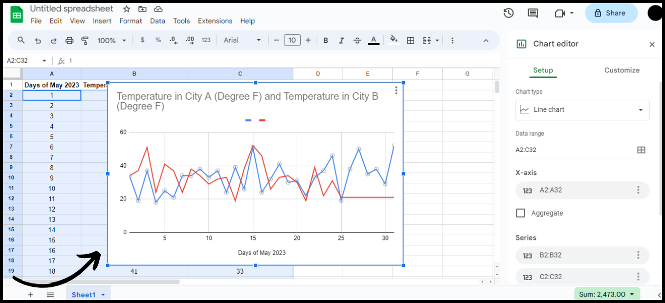
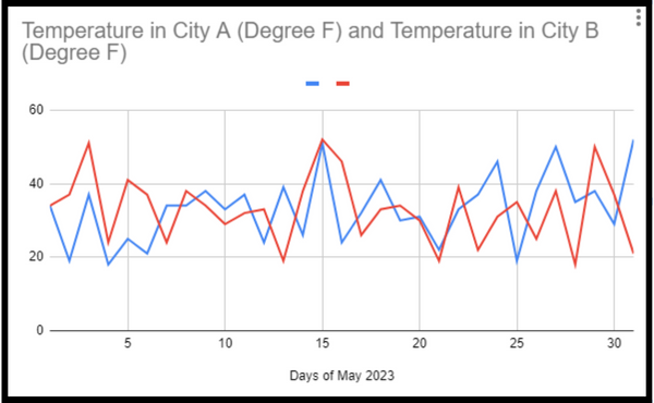
A Line Chart representing Two Data Sets
Different Kinds of Line Graphs in Google Sheets
Google Sheets offers three main types of Line Graphs: Regular, Smooth, and Combo. Here’s what each one does:
- Regular Line Graph – This is the classic line graph, connecting data points with straight lines. It’s ideal for continuous data or to compare multiple items.
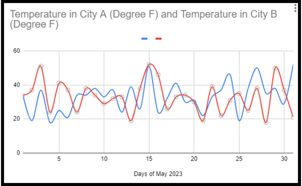
Regular Line Chart - Smooth Line Graph – This type uses smoother, curved lines. While it may not always reflect data as precisely as a regular line graph, it’s great for showing trends over time, especially with larger data sets.
Smooth Line Chart - Combo Line Graph – This combines a Histogram (bar chart) with a Line Chart. This is especially useful when comparing different types of data together.
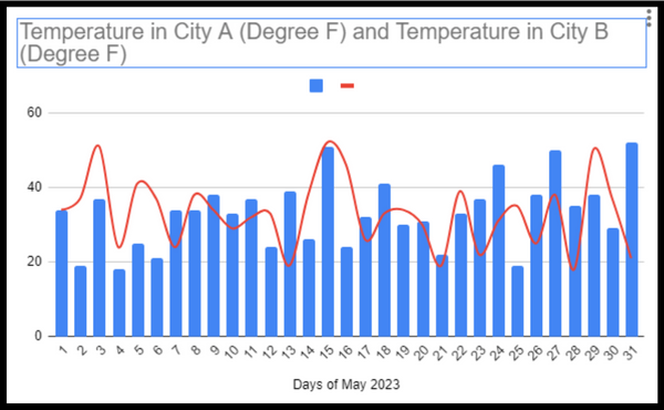
Combo Line Chart
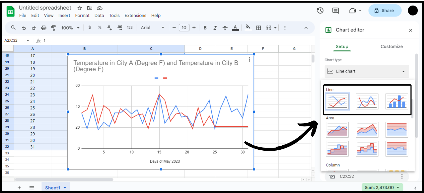
If you want to change the type of Line Chart in your Google Sheet, just follow these simple steps:
- Open the Chart Editor
- Select Chart Type
- Scroll down and find “Line“
- Choose one of the three options available.
Some Important Parts of a Line Graph
To make sure your Line Graph is clear and informative, pay attention to these key parts:
- Title
- X and Y axes — Horizontal and Vertical Axes
- Legend — Explains what each line means
- Grid
- Markers
- X and Y Labels
Customization in Line Graphs
Google Sheets not only lets you add Line Charts, but also customize them so they accurately present your information and still look good visually. Just head over to the Chart Editor and click on Customize.
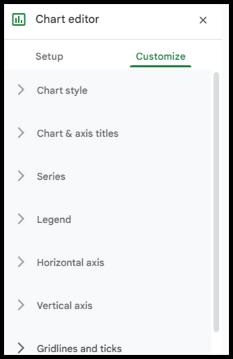
You can personalize your Line Graph in many different ways. Here are some elements you can adjust, but it really comes down to your own preferences:
- Change the color of the lines
- Edit Titles and Labels
- Change the font size and style for not just the title, but for Labels and Legend too
- Make the text italic or bold
- Add a background color to your chart and change the border color as well
- Change the Axis Labels
- Add Major and Minor Gridlines
- Insert a Trendline, Error Bars, and more