How to Make Periods on Google Docs Bigger?
The periods that appear on Google Docs are usually very small in comparison to the rest of the text. And many people are not comfortable with the fact that these periods are not as visibly clear as the text in the document is. Google Docs has no such feature where the periods can be increased in size or weight, however, there are two ways in which you can try to change the size of these periods manually.
Method 1: Increasing the Size of Periods on Google Docs
- First things first, sign in to your Gmail and open a blank document in Google Docs. Add the content in the document as needed. This is how your work will look originally.
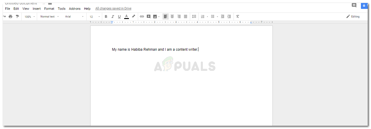
It is highly important that you add the content to your document when using the first method. - Now there are two ways to go about it, you either add the content in the whole document first or then edit the periods in the end. Or, you edit the periods simultaneously. In my opinion, doing it at the end of the work is a better idea as it won’t be very time-consuming. Otherwise, you will need a lot of time to edit the periods on your documents while you are still adding content to the page.
- Select the period which is at the end of your sentence as done in the picture below.

Select the period only. - Go to the Font option, and change the font size specifically for the period.
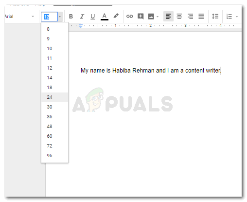
Choose the size. Don’t choose a very large font size as it will stand out in your text. Your period will be larger in this font size in comparison to the way it was in the beginning.
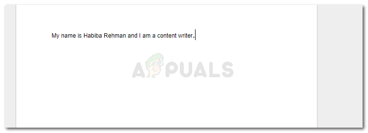
changing the font size to make the periods manually bigger
If you are editing the periods while you are still adding the content in the file, you will have to change the font size again before starting the next sentence. And change it again, when you add the period. Or, select the period and then change it.
You can compare the first picture that I have added and the second one in point number four to see how the size of the period has visibly changed.
Method 2: Increasing the Size of a Period on Google Docs
Instead of manually changing the font size of each and every period in your document, you can try different font styles on the document to see which font displays a better size of the period on your document. This might help you save the time which you otherwise will have to waste during method one.
I kept the original formatting of the font size and style at first and then tried a few different font styles to analyze. Here are a few font styles that I tried, which displayed period sizes slightly better than the one in font Arial.
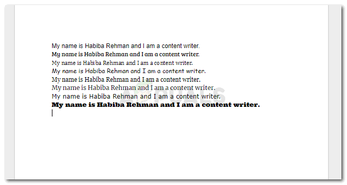
I managed to add all the sentences on one page so that you can compare the difference in the size of the periods and choose the font that fits your requirements the best. I have mentioned below the fonts that I have chosen for all the fonts in the image, mentioning them in the same order as displayed in the image.
Arial
Bree Serif
Cambria
Comic Sans MS
Georgia
Merriweather
Verdana
Ultra
This method, however, can only work out for you in a situation when you don’t have a requirement for a specific font. That way, you might have to edit the periods as we did in the first method. For example, many academic reports, and many schools have a requirement to follow a certain format for the papers, including Times New Roman as the main font for the file. The text for Times New Roman in Google Docs, too, shows the period almost as small as the one shown in Arial font.
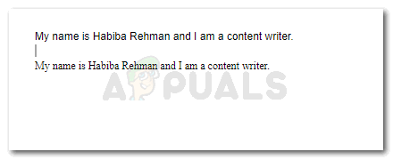
The second sentence in the image is in Times New Roman font, and the period in this font, to me, look even sleeker than the one in Arial.
Whether the document you are working on, say a proposal, a legal document or a project, has the requirement for a certain for a font or not, is something you need to be sure about when working on Google Docs, and when you have a problem with the small periods in the default font settings. Otherwise, you are good to work with this font as well.


