How to Make an Hierarchical Chart on Microsoft PowerPoint
Microsoft Powerpoint is a very interesting program to make impactful presentations. And adding graphs in a Powerpoint presentation could add more details on a slide in a much-summarized way. If you want to add a family tree sort graph on your Powerpoint presentation, then you must follow the steps as mentioned below.
- Open your Microsoft Powerpoint to an empty file, or to an already existing presentation. To make a family tree sort graph, you just require one slide. So, if you want to add this in between slides on an already made presentation, you can follow the same steps like these.
Open Powerpoint to a new or an already existing presentation Change the layout of the slide as shown in the image below. Since it is going to be in a hierarchical order, you might want to keep more space on your slide for it and a lesser space for the heading or title of the slide.
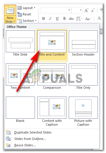
Select a different layout for this slide I chose the ‘Title and Content’ style for my slide. You can choose any of the ones showing as options in the image above. Just remember that the data you need to enter should be visible to the eye even if someone is sitting far away from the screen. And for this, the graph should be on a spacious slide.
- Once the layout of the slide has been selected, this is how your slide will look like.
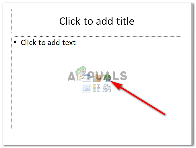
Smart Art Graphic Click on the green and white icon, which is for ‘Insert SmartArt Graphic’. This is where you can add all kinds and types of graphs for your presentation.
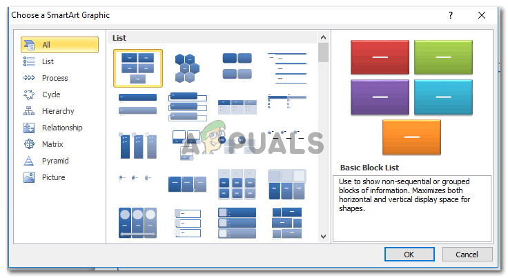
All forms of SmartArt that can be added And this is where we will find ourselves a family tree like chart, which can be found in the ‘hierarchy’ graphs as shown in the image below. A family tree shows a hierarchy, and that is what we need for our presentation here.
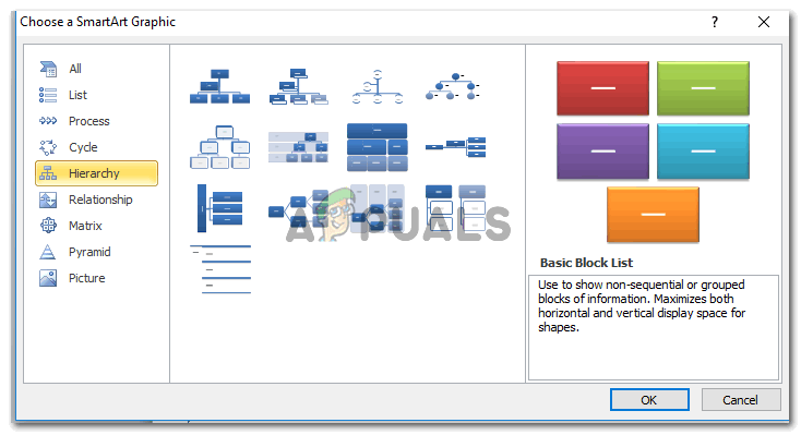
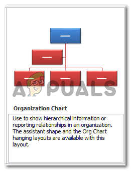
Hierarchy charts that look like a family tree. You can use this for slides where you need to show the steps of a program. Clicking on Hierarchy, you will be shown a few samples of different types of hierarchical charts. Vertically and horizontally spread. You can pick the ones which will suit your data the best. And when choosing a style for the graph, make sure that the data would fit in one slide easily, without looking too stuffed on the screen. After selecting the graph style, click on OK to confirm your graph.
After choosing a chart, click OK - When you press OK, the graph will automatically appear in its original form on your slide.
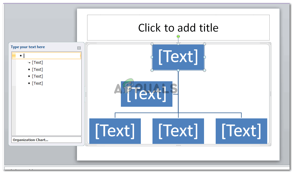
The hierarchy chart that you select will appear in its rawest form You can now edit this the way you want to. Add data to the text boxes as shown in the image below.
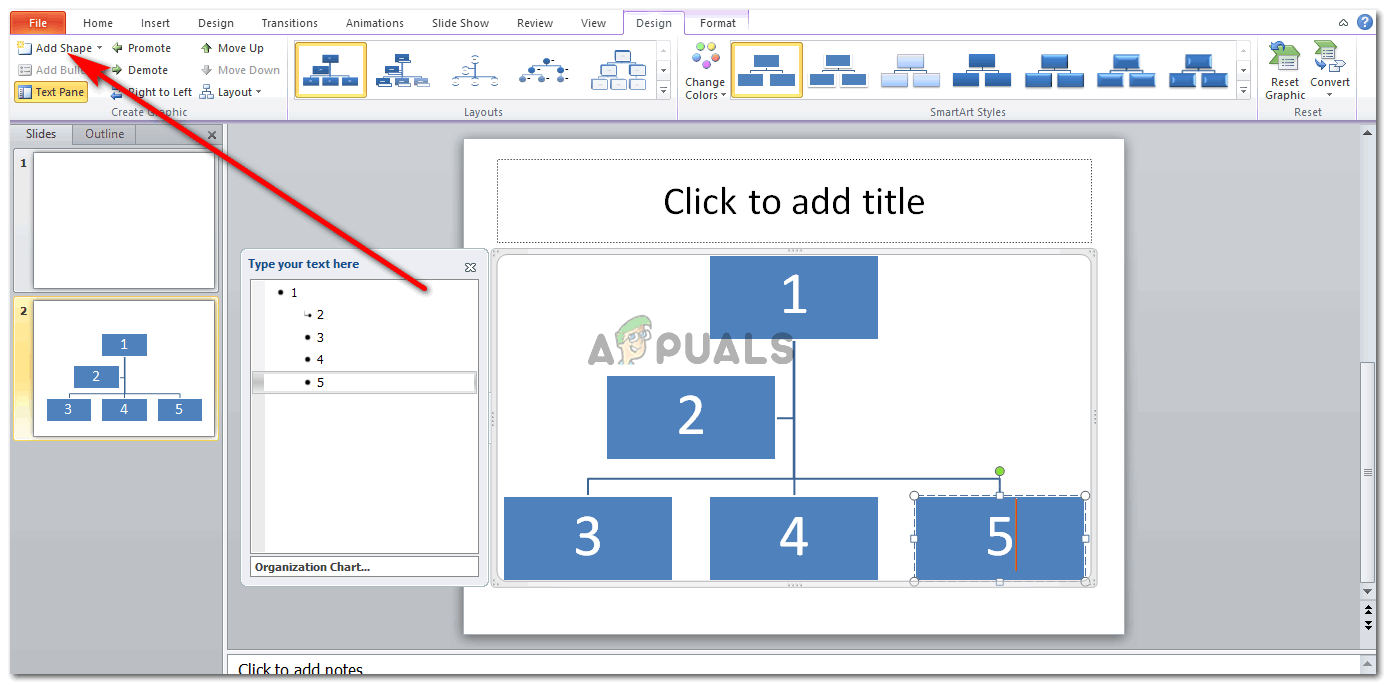
Add data to the shapes, and add more shapes to the chart if needed Now, if you want to add more members to this chart, by adding more shapes/text boxes to the chart, you need to click on the ‘Add Shape’ tab. Clicking on this tab once will add a text box right under the text box that was selected as shown in the image below.
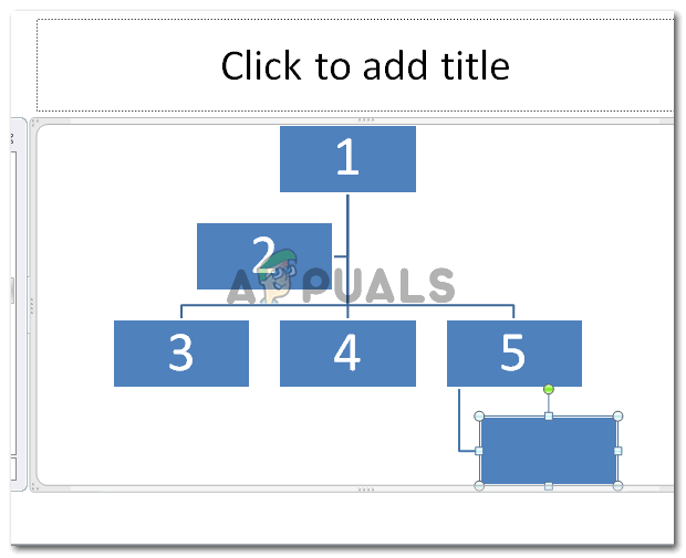
Add Shape But, if you want the placement of the new text box above, or to the left or right of the shape, then you should click on the downward facing arrow like icon right next to ‘Add Shape’. This will show a dropdown list of options for you to add a text box to your chart.
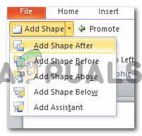
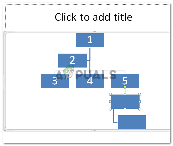
Placing the shape You can add a shape after the selected text box, before it, above it and below it. Choose the option considering your data of course. The purpose of a hierarchical chart is to show the hierarchy. That a certain step or incident happens before the second step or incident. This will help you decide where to place the new shape more appropriately.
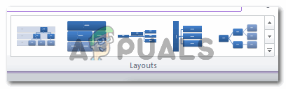
Above, below, after, before - Edit the chart on the go. And according to your presentation requirements. If you don’t like the layout, you can change it even after making the complete slide.
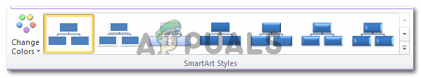
Changing the layout You can change the colors of the chart and add more style to it for making your presentation look more appealing to the viewers.
Edit style The Format option on the top toolbar also offers a range of editing options for you to edit your chart accordingly.
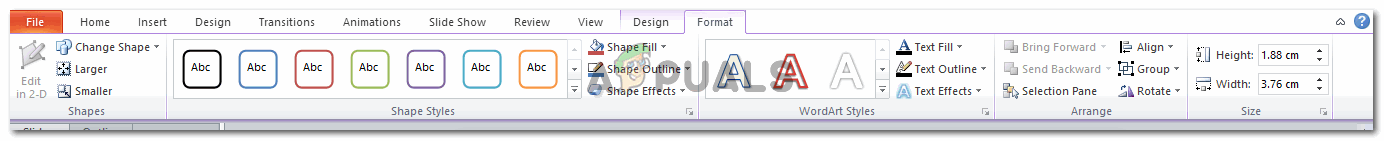
Format
Note: Presentations should be simple, precise and clear. Adding too much content on one slide could make the audience disinterested. Add a few pictures on the slides as well to make it look interesting and not boring. You can also change the shape of the text boxes in the chart to another shape, say a circle, instead of a regular rectangle.