How to Add Axis Labels in Microsoft Excel
Anyone who knows anything about Microsoft Excel knows that one of the many, many features the premiere spreadsheet program for the Windows Operating System has to offer is the ability to create and have charts in an Excel worksheet. There are an array of different kinds of charts you can create on Microsoft Excel (from pie charts and doughnut charts to scatter charts of graphs and bar charts). To make a chart easier to read and understand, Microsoft Excel allows users to add titles to the axes of the chart.
Obviously, this feature is only available for charts that actually have axes in the first place, meaning that charts such as pie charts and doughnut charts can’t really have axis labels. In addition, some charts that have axes (such as radar charts) don’t really have the capability to display axis titles so this feature also doesn’t apply to them.
Axis labels are also available for all of the axes a chart has, which means that you can even have a label for the depth axis in 3D charts and and labels for the secondary horizontal and secondary vertical axes for charts that have them. Excel also allows users to link the label they create for an axis to be linked to corresponding text in a worksheet’s cells by simply creating a reference to those specific cells.
Adding labels to the axes of a chart is a pretty simple and straightforward process regardless of what version of Microsoft Excel you are using. However, it should be noted that adding labels to the axes of charts works a bit differently in Microsoft Excel 2013 and 2016 than it did in Microsoft Excel 2007 and 2010.
To add axis labels in Microsoft Excel 2007 and 2010
To add labels to the axes of a chart in Microsoft Excel 2007 or 2010, you need to:
- Click anywhere on the chart you want to add axis labels to. Doing so will cause a group of tabs titled Chart Tools to appear in Excel’s toolbar with the Design, Layout and Format tabs residing within it.
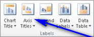
- Navigate to the Layout tab in Microsoft Excel’s toolbar.
- In the Labels section, click on Axis Titles.
- If you would like to label the primary horizontal axis (primary x axis) of the chart, click on Primary Horizontal Axis Title and then click on the option that you want. If the chart has a secondary horizontal axis (secondary x axis) that you would like to label, you can click on Secondary Horizontal Axis Title and then click on the option that you want. If you would like to label the primary vertical axis (primary y axis) of the chart, click on Primary Vertical Axis Title and then click on the option that you want. If the chart has a secondary vertical axis (seconday y axis) that you would like to label, you can click on Secondary Vertical Axis Title and then click on the option that you want. If you want to label the depth (series) axis (the z axis) of a chart, simply click on Depth Axis Title and then click on the option that you want.
- In the Axis Title text box that appears within the chart, type the label you want the selected axis to have. PressingEnter within the Axis Title text box starts a new line within the text box.
To add axis labels in Microsoft Word 2013 and 2016
If you would like to add labels to the axes of a chart in Microsoft Excel 2013 or 2016, you need to:
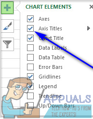
- Click anywhere on the chart you want to add axis labels to.
- Click on the Chart Elements button (represented by a green + sign) next to the upper-right corner of the selected chart.
- Enable Axis Titles by checking the checkbox located directly beside the Axis Titles option. Once you do so, Excel will add labels for the primary horizontal and primary vertical axes to the chart.
 Note: If your chart has a depth axis (an axis only 3D charts have), a secondary horizontal axis or a secondary vertical axis, click on the arrow next to the Axis Titles option and click on More Options… and then enable labels for the depth, secondary horizontal or secondary vertical axes on the chart.
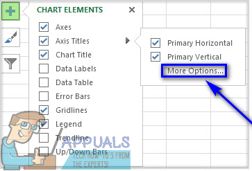
- One by one, click on each of the Axis Title text boxes that appear within the chart and type in the labels for each of the chart’s axes. To start a new line within the Axis Title text boxes, simply press Shift + Enter and a line break will be inserted.