How to Change X Axis Values in Excel
Microsoft Excel is undoubtedly the most powerful spreadsheet program available for the Windows Operating System. Being as powerful a spreadsheet program as it is, Excel is extremely feature-rich. One of the many, many features Excel has to offer to its users is the ability to create charts and graphs. Charts and graphs can be used to represent data in the form of graphics. Excel is capable of taking text and data and turning it into a chart or a graph, plotting each individual data point on the graph. In addition, Excel users have a wide range of different options to choose from when it comes to the kind of chart or graph they want to create.
Almost all of the different kinds of graphs and charts Excel has to offer to users have one thing in common – they have both an X axis and a Y axis. The two axes of a graph or chart are used to plot two different categories of data points. When you create a graph on Excel, you can specify the set of values you want to see on the Y axis and the set of values you want to see on the X axis. In some cases, however, the user ends up creating the graph and then wanting to change the values of, say, the X axis afterwards. Thankfully, that is completely within the realm of possibility.
It is entirely possible for a user to change the values of the X axis on a graph in an Excel spreadsheet to a different set of values in a different set of cells on the spreadsheet. In addition, the process you need to go through to change the values of the X axis in a graph in Excel are quite similar on all versions of Microsoft Excel. If you would like to change the set of values the X axis of a graph in Excel has been plotted using, you need to:
- Launch Microsoft Excel and open the spreadsheet that contains the graph the values of whose X axis you want to change.
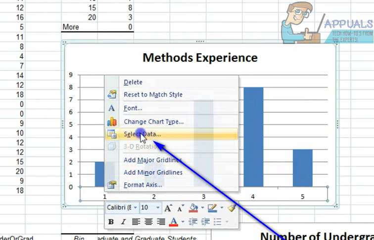
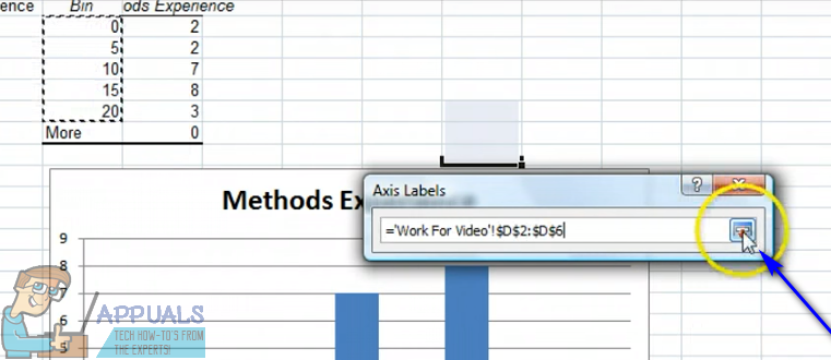
- Right-click on the X axis of the graph you want to change the values of.
- Click on Select Data… in the resulting context menu.
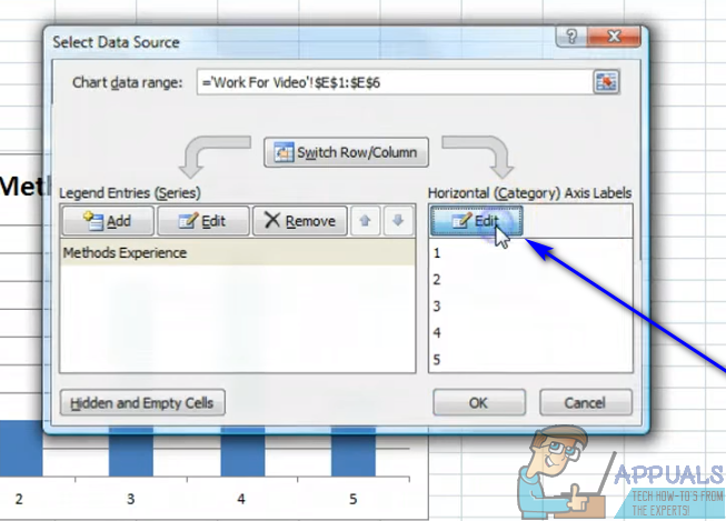
- Under the Horizontal (Category) Axis Labels section, click on Edit.
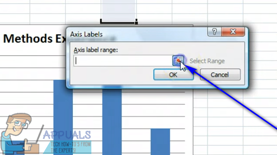
- Click on the Select Range button located right next to the Axis label range: field.
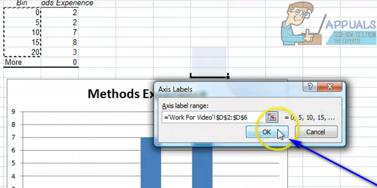
- Select the cells that contain the range of values you want the current values of the X axis of the respective graph to be replaced with.
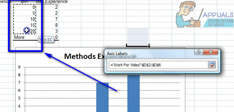
- Once you have selected all of the cells that contain the complete range of values, click on the Select Range button once again to confirm the selection you have made.
- Click on OK. As soon as you do so, the current values of the X axis of the respective graph will be replaced with the new values you have selected.
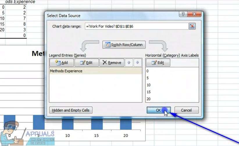
- Click on OK in the Select Data Source dialog to dismiss it.
While the steps listed and described above are intended to be used to change the values of the X axis of a graph in Excel, pretty much the same steps can be used to change the values of the Y axis of a graph in Excel – all you’ll have to do is right-click on the Y axis of the graph in step 2 instead of the graph’s X axis.
Hi, In Excel, in a chart, I am trying to display x-axis lables as years, ie 1994 1995 1996 but I get commas in the year values, ie 1,994 1,995 1996. The column of ‘years’ that I am using as a source is set to not have commas. Is there a way to remove the commas in the x-axis lables? Thanks for any help.